h1
h2
h3
.
.
.
h6
p
watch me flex on this inline yeahhhhh
woh thats pretty cool but check out this custom class attribute ok bruh whatever
if i want to write in a different language, I should change the lang attribute for accessibility purposes, 왜냐하면 it's important for your writing to be recognized by browsers and search engines.
links are like portals. you can use them to link to other sites on the web as well as additional pages of your own site. personally, i think an uncustomized link is kind of ugly. so sometimes, i like to switch it up.
buttons are soooo much fun hehehee. find the hidden carrot if you're hungry.
if you plan on linking to another html page, or adding media files to your page, you've got to have your organizational strategy in check.
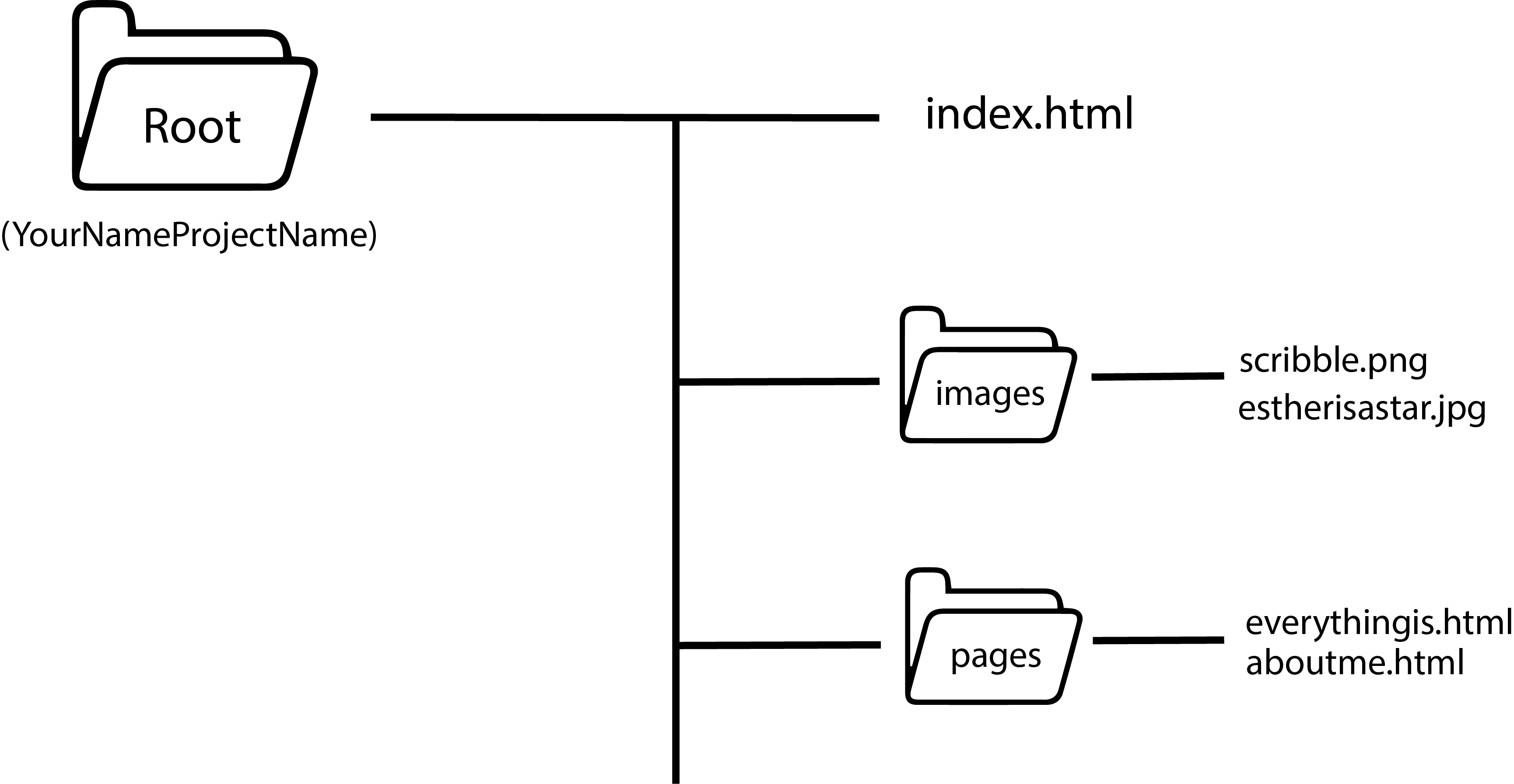
solid file organization is essential to a functioning webpage. get right with it or you will experience codingtrauma...
<-- when insertting your own content, make sure to include multiple src types 4 accessibility's sake. 4 example, i included an mp4 file, and then an ogg audio file. in the event that a browser cant load any of your media, include a troubleshooting message. this practice goes for all types of media.
boxes and things
the box model gives you the power to add borders, padding, and margins to your content. it's used in everything. it is everything. it is the divine.
float and clear are useful tools for box models.
float allows elements 2 sit next 2 each other w/o wrapping
clear specifies what should happen to the element that is next to the floating element. if u want the next element to be below the float, use clear.
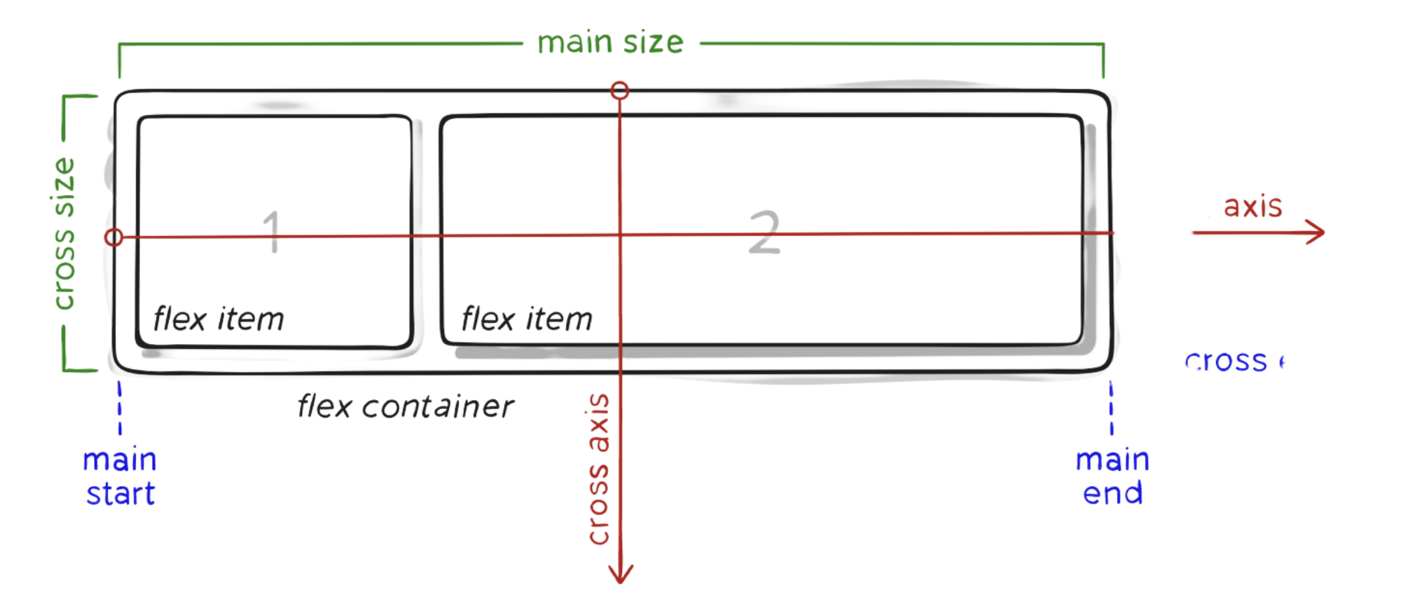
and yeah, right there ^^^? i just flexboxd on you. and imma do it again:
flexbox properties:
- display
- flex-direction
- flex-wrap
- flex-grow
- flex-shrink
- flex-basis
- flex (flex-grow, flex shrink, flex-basis)
- justify-content
- align-items
flexboxes are only one dimensional though. if you want to level up to two, try a grid ↓↓↓
flexbox and grid can be used in conjunction with each other. a flexbox can be nested in a grid and vice versa.
grid properties 4 parent:
- display
- grid-template-columns
- grid-template-rows
- grid-template-area
- grid-template (rows, columns, area)
- column-gap
- row-gap
- grid-column-gap
- grid-row-gap
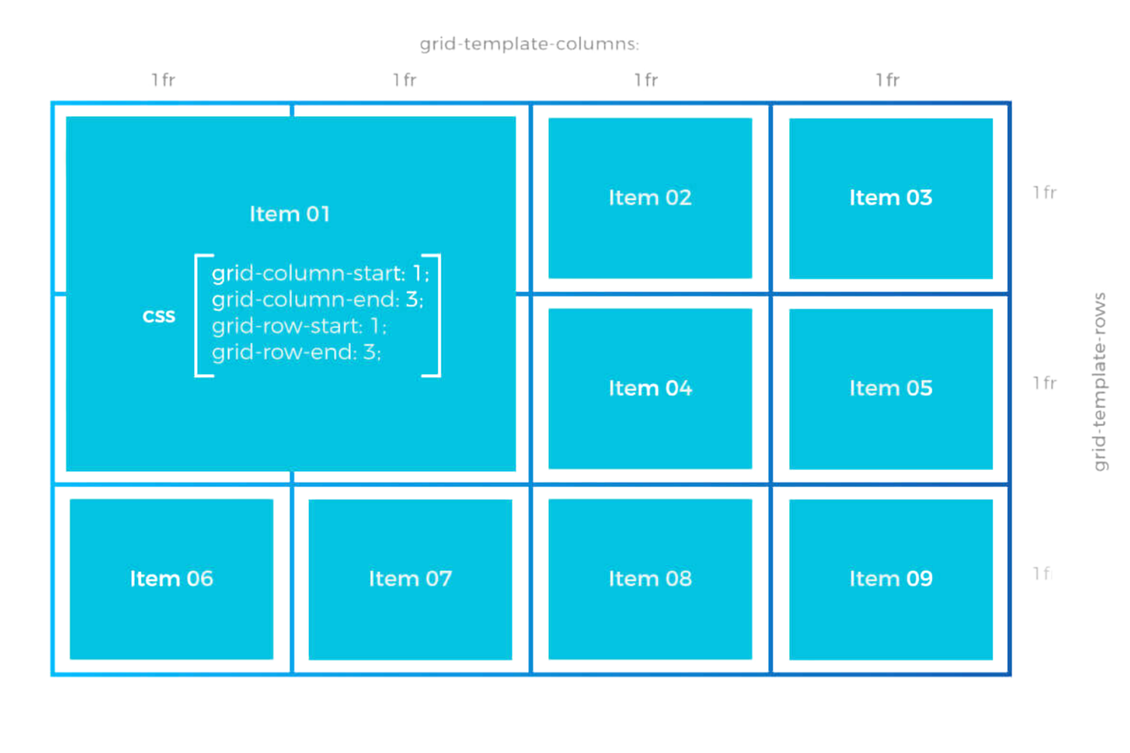
grid properties 4 children:
- grid-column-start
- grid-column-end
- grid-column (start, end)
- grid-row-start
- grid-row-end
- grid-row (start, end)
- grid-area
- align-self